Valorant has one of the most creative maps in a tactical shooter. In the grand scheme of Valorant map design, each map has a unique gimmick that sets it apart from the others, paving the way for fresh agent compositions and gameplay strategies.
The goal is always to deliver a specific gameplay experience for every map, meaning you need to play differently depending on the map.
The team behind Valorant’s map design took the podium in a recent Reddit AMA, fielding questions about the thought process behind creating a brand new map.
- How to combine Brimstone’s Stim Beacon with Yoru, Skye, and Raze’s abilities
- Hiko explains what went wrong with 100 Thieves’ Valorant roster
Gameplay and art go hand in hand in Valorant map design

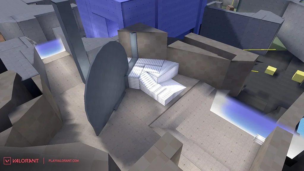
Every map in Valorant starts out as a graybox level. This is the earliest playable version of a map and comprises a rough, blocky version of a map’s layout.
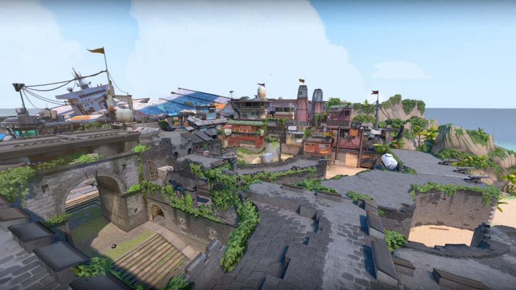
But with settings like Breeze’s balmy tropical island and Icebox’s cold, stark excavation site, players wondered whether maps are designed first around a specific layout or theme.
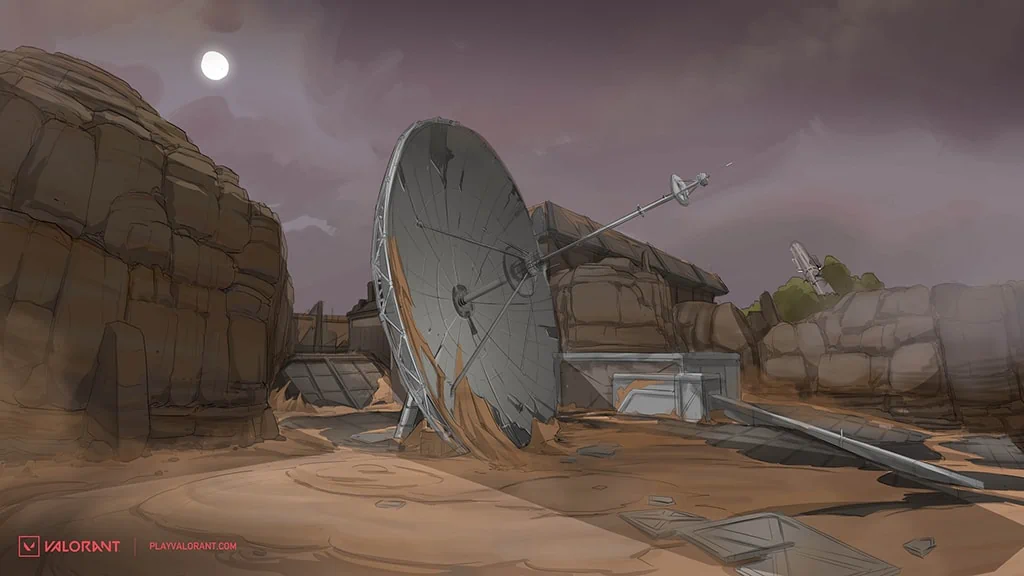
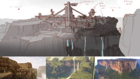
“Our maps are ‘gameplay first’, so the graybox definitely leads the way. That said, theme can often literally give shape to graybox maps and we are usually thinking about the two in tandem,” explained Joe Lansford, Level Designer on Valorant. “Icebox is a great example where the two were developed side by side.”
But how do Valorant map designers come up with a new gimmick for each map? “As for map hooks, sometimes they are solutions to a problem, like how to get from north to south for attackers on Fracture,” Lansford added.
“But sometimes we also build the map around the idea, as with the teleporters on Bind. We take inspiration from everywhere: games, films, real life, and more.”

There are a variety of reasons why the developers might add features like ropes or teleporters. In the case of Bind’s teleporters, they were a result of the map having no dedicated mid. The developers wanted to create a new way to rotate around the map, so they came up with dual teleporters.
However, a lot more detail goes into making a map that is fit for competitive play. The team spends a lot of time deciding how deep cubbies should be and how a certain angle should work.
“We spend hours fine-tuning in the editor. Metrics are all determined by the needs of the space. Take cubby in Green on Icebox versus cubby in A short on Bind. They each need to do different things, so the spaces get tuned accordingly,” shared Lansford.
What follows is a period of extensive playtesting, where the developers check to see if a certain space is doing what they wanted it to do. If not, they go back to the editor to change it.
Every new map should challenge players

From Ascent to Fracture, Valorant’s newer maps differ significantly from the starting maps that launched with the game. This is a deliberate choice on the part of the Valorant map designers, and they wanted each map to test players in a unique way.
“We want each new map to come with its own set of challenges and puzzles for players to overcome and solve. Breeze pushed for larger, more open combat spaces, while Icebox introduced a lot more vertical complexity,” explained Joey Simas, Level Designer on Valorant.
Similarly, some maps are purposefully built to favor different agents. For example, Viper remains a strong pick on Icebox and Breeze, because her Toxic Screen can cut off multiple sightlines that dome smokes cannot.
“We value that our agents can solve different types of spaces and keep that in mind when designing new maps,” said Simas.
However, while the team is keen to constantly push boundaries, there is always room for more traditional maps. They aim to have separate groups of “core” and “unique” maps, according to Lansford, so the map pool feels more diverse.
Moving forward, you can expect more maps of both types, as the map designers work on building out a pipeline of new maps.
You can read the Reddit AMA here.
READ MORE: Valorant devs tease new map and possible night-time variants

